Reimagining an AI Platform for Insurance Agents
Transforming Atidot from a fragmented analytics tool into an actionable AI experience
Employer:
Atidot
Role:
UX Strategy • Product Thinking • User Research • Workflow Redesign • AI Experience Design • Prototyping
The Problem
Atidot is an AI-driven analytics platform for the insurance industry, helping carriers, brokers, and agents identify opportunities around policy retention, cross-sell, upsell, and customer engagement. The platform generated valuable predictive insights, but when I joined as the sole product designer, the product experience struggled to help users operationalize them. It felt more like a technical sales tool than a mature product. Workflows were fragmented. Many features demonstrated possibilities without creating a cohesive experience around action-taking. The biggest challenge was that users still had to connect the dots themselves.
“We like what this can do, but it doesn’t have good functionality.”
“I still need to put the puzzle together”
Users struggled to answer practical questions: Who should I call today? Why is this customer being flagged? What should I say to them? Which insights are predictions versus factual data? At the same time, insurance organizations were deeply attached to their existing CRMs. They had spent years building workflows around them and weren't looking to replace them. They wanted tools that fit into their current processes with minimal friction.
The platform was also so complex that users couldn't get started without help. I led usability workshops to walk new users through the experience. Those sessions were invaluable for surfacing what worked, what confused people, and what they were hoping to accomplish. But the fact that they were necessary was itself a design failure.

Before: Legacy Platform
RESEARCH & APPROACH
To understand the problem space, I immersed myself in the business and customer environment. I sat in on prospect meetings, watched sales demos, ran client workshops, led onboarding calls, and presented the platform directly to brokers and agents. This gave me a unique understanding of how the company positioned the product, what clients actually valued, and where confusion repeatedly surfaced.
Engineering bandwidth was extremely limited, so a full rebuild was unrealistic. I created a prioritized backlog centered around one design principle:
Move users from insight to action as quickly as possible.
That principle drove every product decision that followed.
KEY PRODUCT CHANGES
1. Simplified Navigation & Workflow Cleanup
The platform contained many partially built or broken workflows that added confusion without driving action. I audited the experience against usage data and user feedback, then removed flows that were redundant, created cognitive overload, or interrupted user momentum.
We reframed campaign recommendations into lightweight tools that could be copied and pasted into clients' existing marketing systems, rather than forcing them through entirely new processes. The navigation was streamlined so users could focus on actions instead of hunting for features.

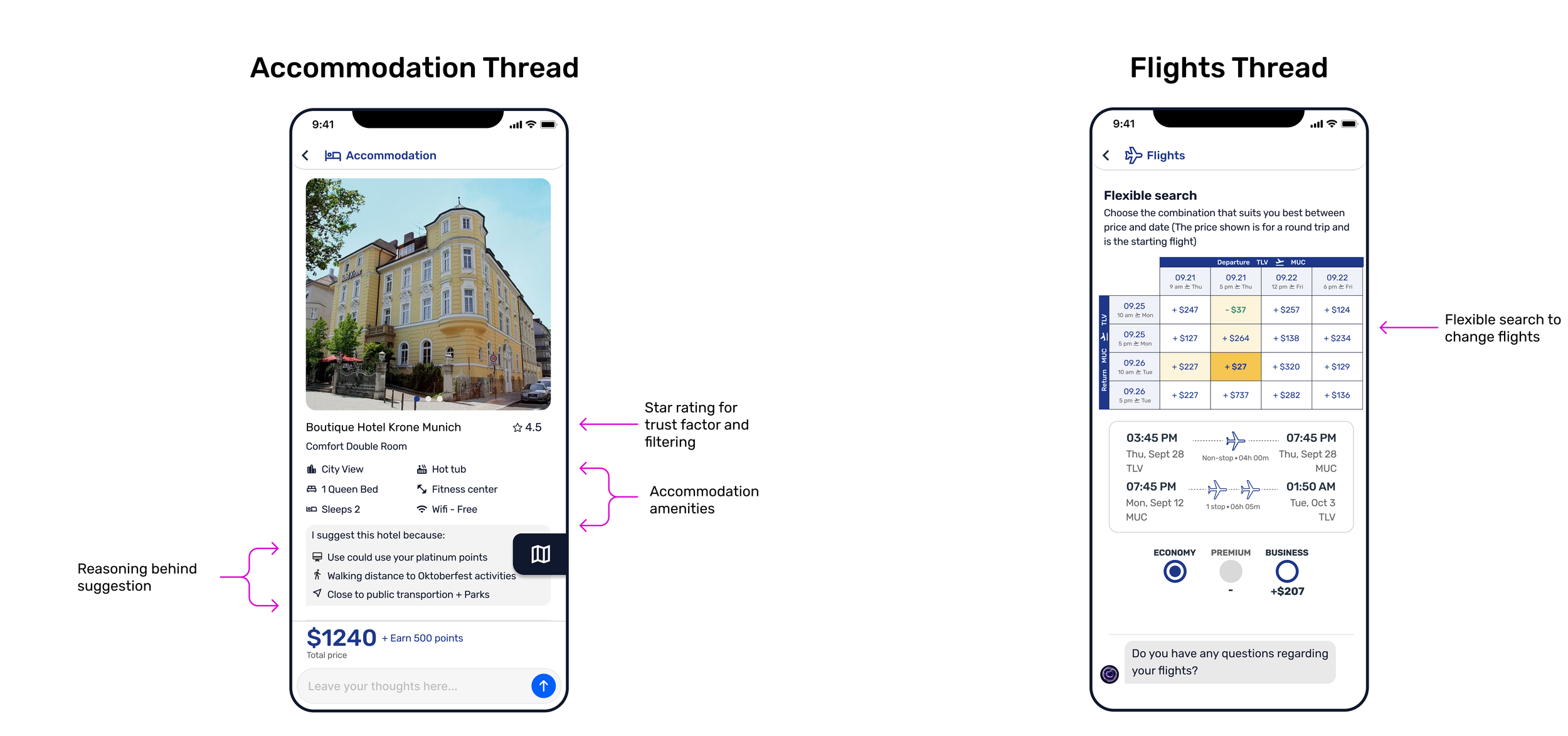
AI Trust Signals
Through sales calls and prospect meetings, I noticed clients were skeptical of "black box" predictions. I pushed for greater transparency across the platform:
Prediction language. "Will lapse" became "likely to lapse based on..." Acknowledging uncertainty without undermining confidence in the AI.
AI disclosure badges. Clear indicators on all AI-generated content, so users always knew what came from the model versus confirmed data.
"Why now" signals panel. Showed the ranked factors behind each prediction. Users could see the reasoning, not just a risk score.
The goal was to make the platform feel less like a black box and more like a collaborative assistant.
AI Outreach Composer
3. AI Outreach Composer
This was designed to solve the core pain point we heard in nearly every customer conversation: users knew the insights were valuable, but they struggled with the next step.
“What should I say when I pick up the phone? My model said you are at risk of lapse?”
I designed an AI-assisted composer that generates personalized outreach with the correct tone (email, SMS, or call script) directly from the platform's segmentation within the workflow.
This wasn't added because AI writing was trendy. It directly addressed one of the most common operational pain points: reducing the effort required to act on recommendations and making the platform practical for day-to-day use.
Campaign Page
AI Trust Signals
2. AI Transparency & Trust
One of the most requested capabilities was a simple way to act on segments without requiring a full CRM integration. I designed a campaign page where users could view a segment of flagged policyholders, then download or copy the list directly into their own marketing systems. No integration setup, no new tools to learn. Users could go from insight to campaign in minutes, using the systems they already had in place.
4. Campaign Page
WHAT I CHOSE NOT TO BUILD
Early in the redesign, I advocated for adding an AI chat assistant to the dashboard. My reasoning was straightforward: conversational AI was becoming an industry standard, and I believed users would prefer asking questions about their data over navigating the interface themselves. I built a prototype and repeatedly made the case for it internally.
“This again complicates the platfrom”
But after serious discussion with team leads and our CEO, I realized my case wasn’t concrete. The discussions reinforced the central lesson of this entire project: less is more. Users didn't want another layer on top of the product. They wanted the product itself to be clear enough that they didn't need help interpreting it. I let the idea go. It was the right call
“What problem are we trying to solve?”
OUTCOME
The redesign transformed the platform from a fragmented analytics experience into a guided, action-oriented product. Most importantly, the experience shifted from simply presenting data to helping users make decisions with confidence.
5x
Increase in client sign-ups after onboarding redesign
Before: Legacy Platform
Before: Legacy Platform

It shaped the AI to be more than a planner—an intuitive, culturally aware assistant.
User Snapshot: The Israeli Traveler
“I need a vacation… but I don’t have three hours to plan it.”
Our core users were busy Israeli parents juggling careers, family life, and unused loyalty points. Travel was a priority, but planning felt overwhelming.
Why it matters:
7M+ outbound trips from Israel in 2022
Travel market expected to hit $40B by 2027
Projected Loyalty Market Growth to $966.4 Million by 2027
Designing the Experience
The heart of this project was crafting an AI interaction that felt helpful, human, and deeply personalized, while reinforcing customer brand loyalty through smart, timely recommendations.
We mapped out:
How the AI responds to vague or evolving requests
How to handle mid-journey changes
The relationship users will have with the AI

Plan A: A Full Mobile App Prototype
To bring this vision to life, I designed a fully interactive, end-to-end mobile app in Figma that showcased:
Personalized trip flows
Smart destination suggestions
Retail point redemption
Dynamic offers and upgrades
This app prototype became the centerpiece of investor and partner conversations, clearly demonstrating how Via.ai could unlock new revenue and deepen loyalty through seamless digital concierge services.


Our business partners loved it.

As the roadmap took shape, we hit a reality check
🚧 With limited engineering and tight deadlines, a full launch wasn’t possible… yet.
Plan B: Bring It to WhatsApp
So we adapted. Fast.
We asked: How do we preserve the magic of this concierge experience, with zero downloads, and maximum reach?
Answer: WhatsApp.
✓ Used daily by 95%+ of Israelis
✓ Already trusted for personal and business communication
✓ Perfect for delivering conversational AI experiences

Users could:
✓ Chat with the AI agent
✓ Get curated, personalized trip options
✓ Adjust preferences on the fly
✓ Book without ever leaving the conversation

Impact
The design work paid off—literally.
The prototype helped Via.ai secure funding (Can't publicly disclose)
It was a key piece in partner discussions with top Israeli travel retailers, banks, and airlines
Our pivot to WhatsApp enabled a faster go-to-market strategy, accelerating pilot deployments with a major airline
This project wasn’t just about nice screens. It helped unlock real traction and bring a big vision one step closer to reality.
Reflection
This project wasn’t just about designing a product, it was about translating a bold vision into an actionable experience and strategy under real-world constraints.
I learned to lead UX through rapid pivots
I helped shape product strategy and investor messaging
I got to have a significant impact on real-life projects
Biggest takeaway: Sometimes, the smartest design move isn’t building more. It’s building smarter, with empathy, creativity, and a relentless focus on the user.