Reimagining Atidot's AI Platform for Insurance Agents
Transforming Atidot from a fragmented analytics tool into an actionable AI experience.
The problem
Atidot is an AI-driven analytics platform for the insurance industry, helping carriers, brokers, and agents identify opportunities around policy retention, cross-sell, upsell, and customer engagement. The platform generated valuable predictive insights, but when I joined the product, the experience struggled to help users operationalize them. It felt more like a technical sales tool than a mature product.
Workflows were fragmented, and many features felt like isolated proofs of concept rather than a cohesive ecosystem. The core challenge was a lack of intuitive integration: users were left to figure out on their own how to fit the product into their daily routines.
"We like what it can do, but it doesn't have good functionality."
— Prospect, during a sales call
Users struggled to answer practical questions: Who should I call today? Why is this customer being flagged? What should I say to them? Which insights are predictions versus factual data?
The platform was also so complex that users couldn't get started without help. I led usability workshops to walk new users through the platform. Those sessions were invaluable for surfacing what worked, what confused people, and what they were hoping to accomplish. But the fact that they were necessary was itself a design failure.
Research & approach
To understand the problem space, I immersed myself in the business and customer environment. I sat in on prospect meetings, watched sales demos, ran client workshops, led onboarding calls, and presented the platform directly to brokers and agents.
This gave me a unique understanding of how the company positioned the product, what clients actually valued, and where confusion repeatedly surfaced.
Engineering bandwidth was extremely limited, so a full rebuild was unrealistic. I created a prioritized backlog centered around one design principle:
Make insights as easy as possible to act on.
That principle drove every product decision that followed.
Key product changes
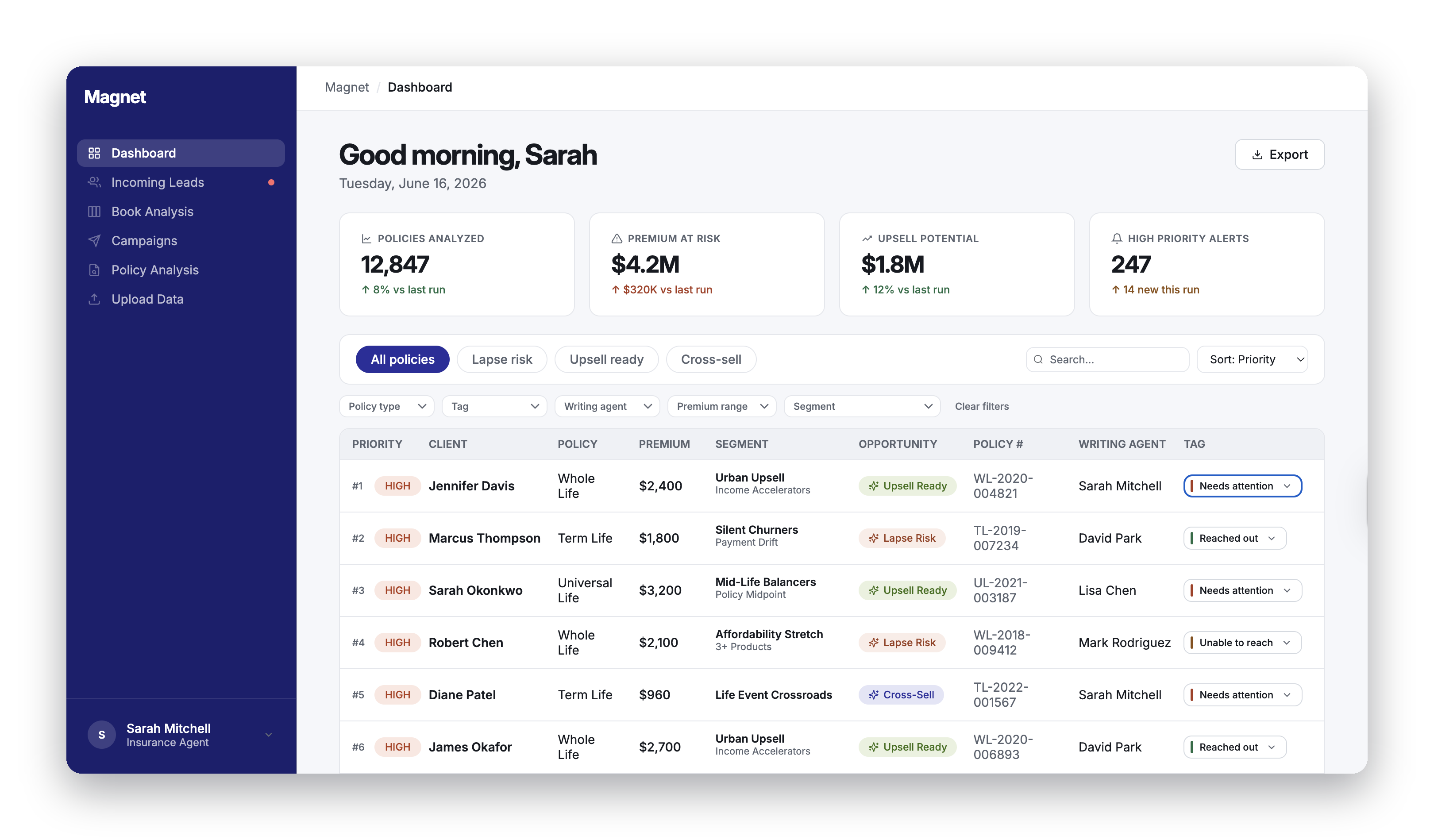
Simplified navigation & workflow cleanup
I audited the experience against usage data and user feedback, then removed flows that were redundant, created cognitive overload, or interrupted user momentum.
We reframed campaign recommendations into lightweight tools that could be copied and pasted into clients' existing marketing systems, rather than forcing them through entirely new processes. The navigation was streamlined so users could focus on actions that they understood.
AI transparency & trust
Through sales calls and prospect meetings, I noticed clients were skeptical of "black box" predictions. I pushed for greater transparency across the platform:
- Prediction language. "Will lapse" became "likely to lapse based on..." Acknowledging uncertainty without undermining confidence in the AI.
- AI disclosure badges and AI icon. Clear indicators on all AI-generated content, so users always knew what came from the model versus confirmed data.
- "Why now" signals panel. Showed the ranked factors behind each prediction. Users could see the reasoning, not just a risk score.
"What is fact? What is a prediction?"
— Agent, during a usability session
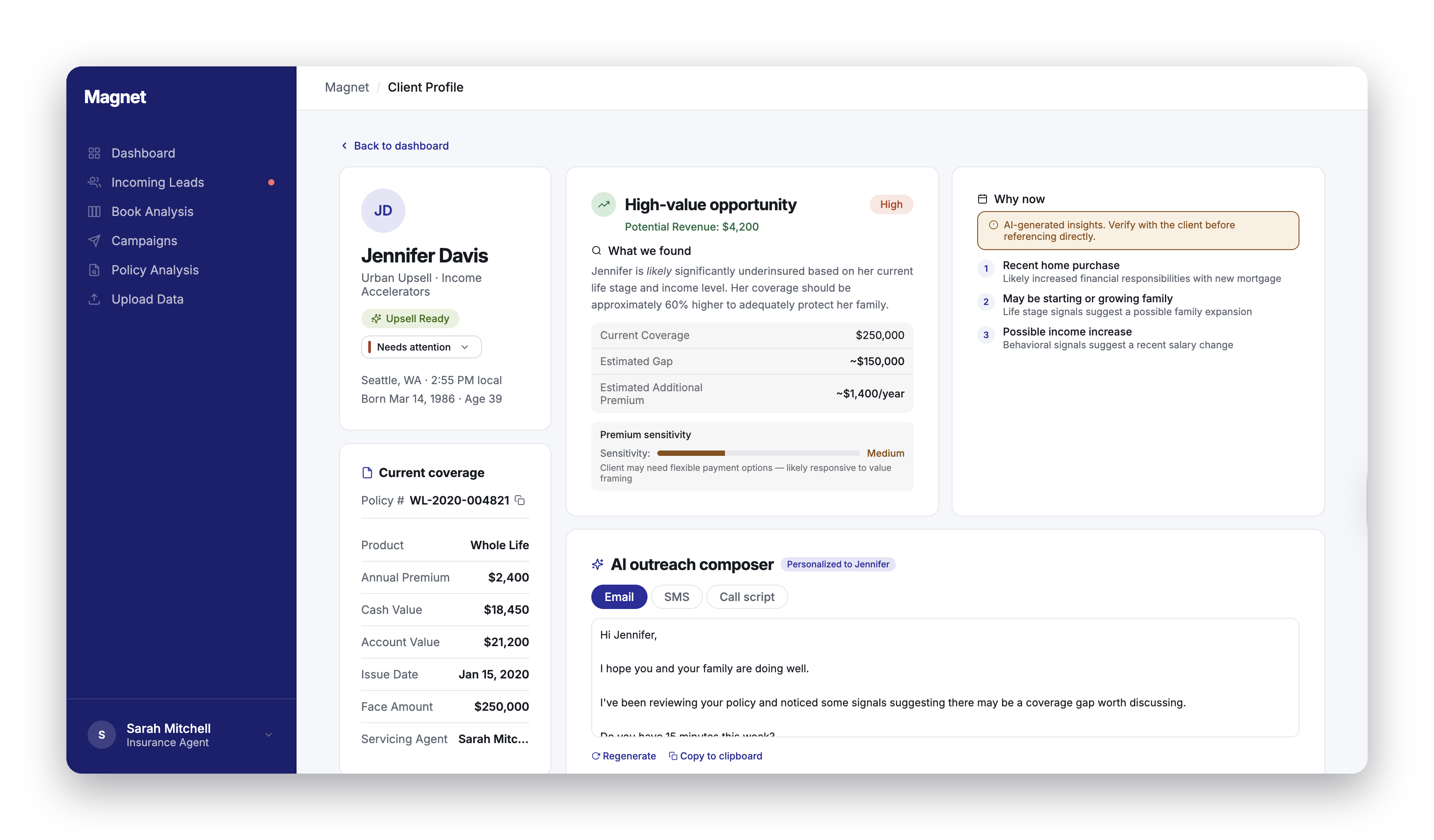
AI outreach composer
This was designed to solve the core pain point we heard in nearly every customer conversation: users knew the insights were valuable, but they struggled with the next step.
"What should I say when I pick up the phone? My model said you are at risk of lapse?"
— Agent, during a usability session
I designed an AI-assisted composer that generates personalized outreach (email, SMS, or call script) directly from the platform's segmentation within the workflow. Users could draft communication based on the specific signals that flagged each policyholder, then copy it into their existing tools.
This wasn't added because AI writing was trendy. It directly addressed one of the most common operational pain points: reducing the effort required to act on recommendations and making the platform practical for day-to-day use.
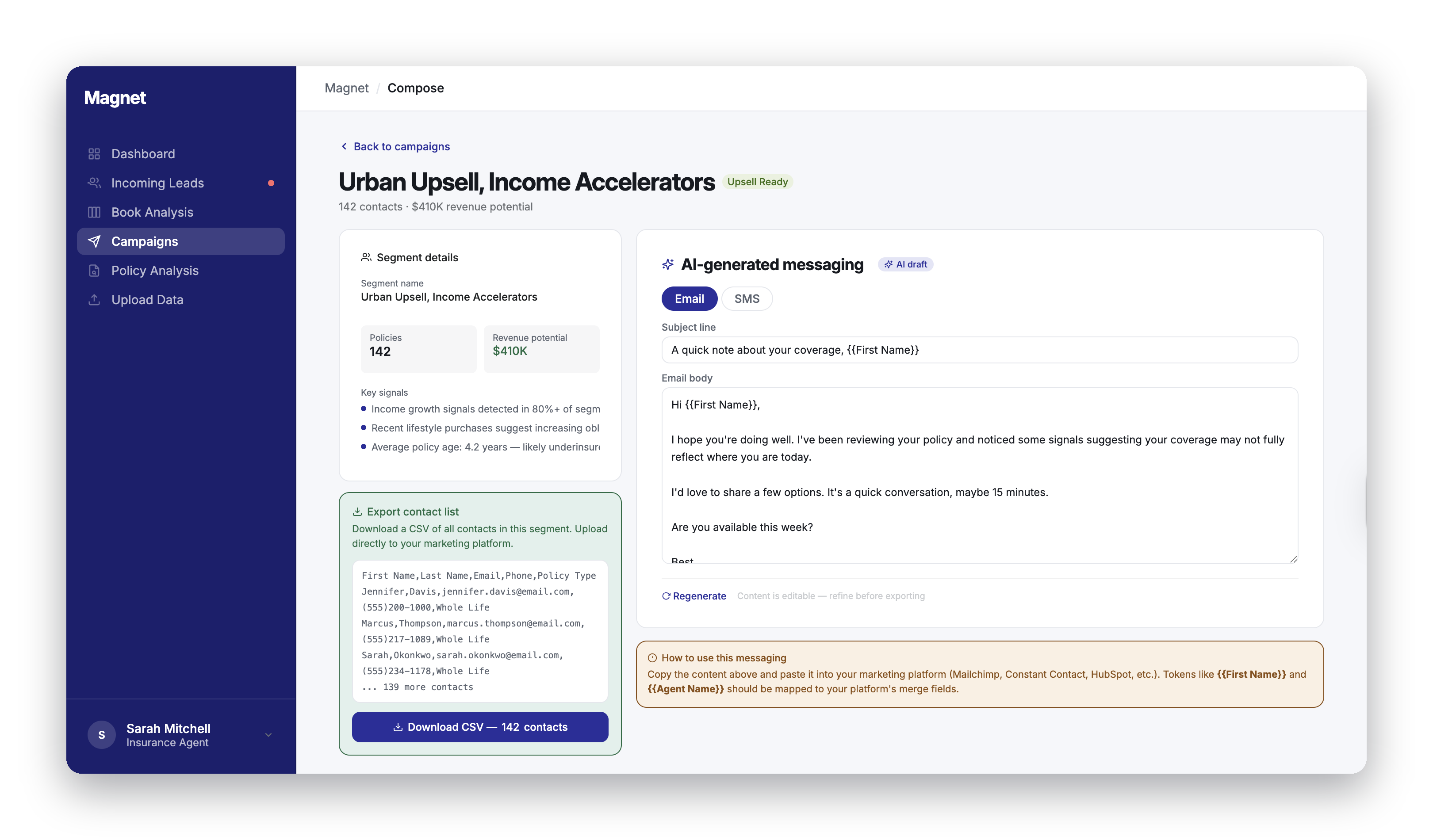
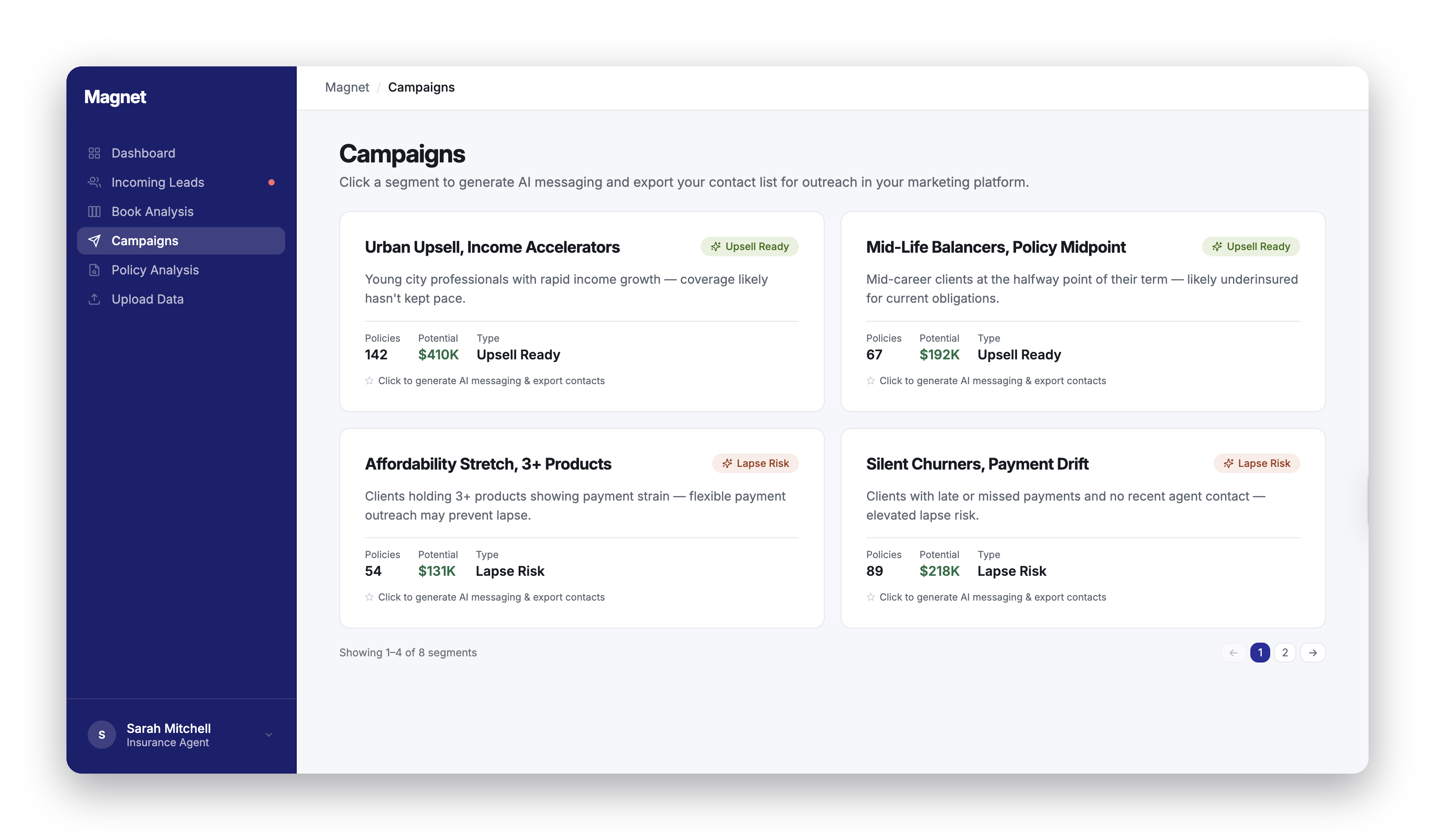
Campaign page
One of the most requested capabilities was a simple way to act on segments without requiring a full CRM integration. I designed a campaign page where users could view flagged policyholders, then download or copy the list directly into their own marketing systems.
No integration setup, no new tools to learn. Users could go from insight to campaign in minutes, using the systems they already had in place.
What I chose not to build
Early in the redesign, I advocated for adding an AI chat assistant to the dashboard. My reasoning was straightforward: conversational AI was becoming an industry standard, and I believed users would prefer asking questions about their data over navigating the interface themselves. I built a prototype using Claude Code and repeatedly made the case for it internally.
But after serious discussion with team leads and direct conversations with clients, I realized the interest wasn't there. Users told us:
"If the platform is easy to use, I shouldn't be needing to ask the chat something."
— Client, during a feedback session
"This again complicated the app even more."
— Prospect, during a demo
The feedback reinforced the central lesson of this entire project: less is more. Users didn't want another layer on top of the product. They wanted the product itself to be clear enough that they didn't need help interpreting it. I let the idea go. It was the right call.
Outcome
The redesign transformed the platform from a fragmented analytics experience into a guided, action-oriented product. Most importantly, the experience shifted from simply presenting data to helping users make decisions with confidence.
AI trust features (disclosure badges, prediction language, signals panel), workflow cleanup, onboarding redesign, campaign page, and the outreach composer are all shipped to production.
Sales team reported shorter demo-to-close cycles and fewer objections around platform usability.
What I learned
Sell impact, not features. Sitting in sales calls taught me the fundamental difference between how product teams and sales teams communicate. I would explain features while they would explain impact. Prospective leads were far more interested in what the product could do for them than how it worked. That lesson reshaped how I present design decisions to stakeholders and users alike.
AI transparency is a design problem. Trust doesn't come from better algorithms. It comes from helping users understand what the AI is telling them and why. Making predictions feel transparent and explainable was one of the most impactful things I worked on.
Good design requires advocacy. With limited resources and competing priorities, design improvements don't happen by default. I learned to make the case for design decisions in terms the business understood, and to prioritize ruthlessly so that every change we shipped actually mattered.
Product strategy and design are inseparable. This project was as much about product strategy as it was about interfaces. I'm grateful for the opportunity to take ownership of both, from deciding what to cut to defining how the platform should evolve.
Most importantly, I learned how valuable it is to understand not just the users, but the business conversations happening around the product. Sitting in sales calls, demos, and workshops gave me insights I never would have uncovered through interface analysis alone.